Plotting Financial Data
Learn to plot financial data in MATLAB® by:
- Creating easy visualizations with simple point-and-click plots
- Customizing plots and reproducing layouts for new data
- Choosing advanced plotting options like geographic, animated, and 3D
- Exporting plots to image files or report documents
Published: 21 Oct 2020
Hello, and welcome to today's session on creating plots in MATLAB. I'm Lawrence, an application engineer at MathWorks. Here's our agenda for today. We'll start by looking at simple point and click plots in MATLAB. Further, we'll explore some advanced plots, such as geographic plots. We'll close by looking at how to update plots programmatically.
The data that we'll be working with today is time series or stock data. So we have the prices of different stocks in our data. Let's switch over to model. Before we start with program in MATLAB, let's look at the Excel file. Here I've got 30 different stocks. And the prices of each of these stocks, from beginning of 2018 until the end of 2019.
Let's go ahead and bring this data into MATLAB. I'm working off the script called creatingplots.mlx. To bring data into MATLAB I use this function, read time timetable. In doing so, I've extracted the values and the data from this Excel file entirely into this variable called prices.
By hovering over this variable, I can get a glimpse of what is stored inside prices. If I want to interact with it, I right click on it, and I click on open prices. Doing so opens the variable in the variable editor window. To create a plot, I select the columns that I want to plot, click on the plots tab, and select the type of plot that I want to choose.
Here I want to create a line graph. So I click on plot. At this point, you can see that the plot has been created, the plot has chosen to put the time axis on x-axis, and price data on the y-axis. I have data going from beginning of 2018 until end of 2019. If I zoom in, observe what happens to x-axis. X-axis has automatically updated. Based on the granularity of data, you could go down up to nanosecond level precision.
If I want to plot more than one column, I can press control, and choose those columns. And click to plot. And it plots the values that I chose to plot. Now, when I have been doing this, MATLAB writes code that actually creates this plot in background. So the first plot that we created, that was a simple plot. For the second plot, it specified this command, and it created that plot.
Just by clicking up arrow, I can recreate the plot. In the next step, we are going to look at bar plots. So we're going to work off a simple data set. In the prices table that we saw, we are looking at the first five columns, we are extracting the maximum and the minimum values.
So my bar data contains the maximum values and the minimum values. If I want to create a bar chart, I open it by clicking on control D, which is the shortcut that has been recommended. That has been set for opening bar data. Click on this, control D, that opens the variable. I select these two columns. Go into plots tab, and create select bar.
Doing so opens the bar chart. At this point, you can go ahead and make this graph more useful by inserting some extra information. So let's start with insert x label, and say stock names. Insert y label, max/min prices. Doing so, you can see that the value over here, the label over here, has been rotated by 90 degrees.
If that's not something that you want, go to view, property inspector. It opens up a window onto the right hand side. Click on the property that you want to modify. It brings up the property that corresponds to this value, the values that you could change that correspond to this property.
So in our case, if we don't want to keep a 90 degree rotation, it could set it back to 0. In which case, you can see that the property has been set to 0 degrees of rotation. Let's just put it back to 90. I could go ahead and insert a title. Let's say max and min values of stocks. Could go ahead and insert legend, which has picked up the values from bar data. The first column and the second column.
Let's go ahead and make that more useful by specifying max values, min values. I can add more annotation by specifying a text box. My plot. If you're happy with the plot, you could go ahead and click on save as. And save into any format image format that you choose. You could be a bitmap, jpg, pdf, png.
But once you do that, you lose this interactivity that you have the image. To preserve the interactivity, save it as a MATLAB figure, which has to extension fig. In which case, you'll be able to continue working interactively with this image. If you want to add labels to the x-axis, I click on this element here. And it has updated the values over here.
Now you can see that I have two different elements for the x-axis, which x tick, and x tick label. What does that mean? It means that on x-axis, I have five different data points, which corresponds to x tick. And the labels have been just set to those values. To dynamically update them, I could say A, and that value has updated over here. For the second value I said B, and that value has updated over here.
Click on that. B. And that value gets updated. Now, doing so might be a bit difficult. So that may be something that we want to do programmatically. So when we have just five values to work with, it's easy to work off. What if you have more stocks to work with.
Updating each of those values might prove cumbersome. So to do that, let's have some data where we have more values. So I'm picking up the first 10 stocks. The value, the maximum values, observed for the first 10 stocks. And the minimum values for the same 10 stocks. And I'm also capturing the labels.
So let's open our data by clicking on it, and clicking on open variable. So here we see we have 10 rows. I select both of these columns, and click on bar data. In order to update the x-axis programmatically, I need to access a variable that contains information about that image. So to do that, I use the function called GCA, which gets the current axis into a variable.
So I do that by specifying my fig equals GCA, in which case you can see there are some properties that shows off for the current image. If you want to have a look at all the properties, click on show all properties. Here you can see that there are lots of properties that have been captured for this image.
The one that we want to work with is the x tick and x tick label. Let's go ahead and look at what's stored in x tick label currently. Myfig.xtick label. We can see that it has stored the numbers as the values that go along with the ticks. So in order to set the labels that we have extracted for that image. Let me put MATLAB on to the right hand side.
Note how we have these numbers, and how we're going to change it. So let's say set, my fig. And the value that I'm setting is for x tick label. And the value that I'm setting it with is stored in labels. I've got 10 values in here. As soon as I execute this command, you would see how these values get updated. There you go, these values get updated.
Let's show that profit once again by using this command SHT. It brings the graph to forefront. Let's make some changes. Let's say insert x label, stock names. Insert y label. Max/min prices. So here you can see I'm redoing the same things again. Now, is there a way to prevent redoing this whole process once again when I have some new data?
Yes. The solution is to generate code for whatever you have recorded over here. So once you have done some operations, and you want to preserve it, you go ahead and click on file, and choose generate code. So it generates code for whatever you have done. And you could use that the next time by just calling that function. So let me illustrate.
So here, I'm calling in new sets of data. So here I've got 20 stocks from columns 10 to 30. And here is my new bar data. So the function that we created, called create figure, that looks like that. I go ahead and pass that new data to this function that we created. Create figure. And here, you can see that it has made that plot using this function.
The next kind of plot that we're going to look at is histogram. So histograms are usually used with returns data. So to compute returns data from prices, we use this function called tick direct. When we execute this bit, we get returns stored. We get returns calculated from prices. So in this table, you're looking at returns. Particularly daily returns.
To have an understanding of the returns of one of these vectors, let's say returns.abt, which is one of these stocks. All I have to do is pass that vector into the histogram function. And it creates a function over here. There are more properties that you could modify by looking at documentation. So for doing that, I clicked on that function and pressed F1. Or I could even right click and look for help on histogram.
So here are other properties that I could change for histogram. If I want to look at the histogram of two different returns simultaneously, I could use the function called histogram 2. And pass the two different return vectors to that function. Now what does that look like? So that's a 3D view of two different sets of returns. So if I were to look at the first set of returns, just a histogram of the first set of returns, I would have probably seen just that. And if it were to look at the second set of returns, I would have seen just that.
If I want to look at the interaction between these two, I could play around, find a view that I'm particularly comfortable with. And once I'm happy with a view, update code. In which case, this becomes my view the next time I load around this command. So I execute it, it preserves this view.
Now next, let's look at pie charts. So let's imagine that we have a portfolio of 15 different stocks. I've got 15 different constituents. And from prices, I'm extracting the prices for the first 15 constituents. I'm also extracting the label names of these constituents. Now for weights, I'm just looking at, I'm just generating random weights. 15 different random weights. I'm normalizing them to sum up to 100%.
Once that is done, I look at my data weight vector, which is stored in weights. In order to create a pie chart, all I have to do is select this column, click on plots, click on pie. It has created a pie chart. Now to associate a name to each of these pies, I say insert legend. And it has inserted this value in this legend over here.
To update the values of these legend to make it more sensible, I'm going to edit the values of legend. I could either edit it manually, or I could use property inspector, bring up property inspector, click on legend. And then have this property modified. So for doing that, remember that I have extracted the names of stocks into this variable called my portfolio constituents. I copy these values, go back here, and replace them with those values.
As soon as I click away, these values get updated. And that's my pie chart. In the next section, we'll be seeing how to add this name right next to the pie values over here. Doing that is simple. So you need to construct a string. So in my case, I've constructed a string called pie labels. And depending on if you want to call out certain parts of the pie, you will create a logical vector for those spots that you want to call out.
And then you provide the weights that you're plotting. So let's say that you have your weights in here. And your labels that go along with each of these. You execute this command. You've got a pie chart with the labels that go along with each of these pies. If you don't want to call out any of these pies, remove this argument, call explode. So you call pie with weights and the labels. In which case you have just a pie chart with none of the bits that have been called out.
The next plot that we'll be looking at is scatter chart. So once again we'll be working off of the returns data. So for doing that, we can use the function tick direct. Execute this. We open this variable. Open. Now to look at how two different sets of returns interact, correlated, I could look at a scatter chart.
So I do that by selecting two different vectors, and then looking at scatter chart. Now at this point, to look at what value has been plotted over here, I could hover over here. Or I could even use data tips, which is this button over here. I'm clicking. I get this value of x and y highlighted.
If I want to have some information, let's say I want to say this is the value of x. I right click on that. Use this function, this option called update function. I edit. And specify what I want to specify over here. Let's say this is the value of x. If I save that as my function, and store that over here. If I go back to my plot SHG, you can see that now this displays this extra line of command that I've added over here.
Now if I select any of these points, it shows this string along with the value that gets selected. Delete all data tips. So to get rid of data tips, right click on it, delete all data tips.
In this particular case, we're looking at two different return vectors. What if we want to look at multiple return vectors. So let's say we're going to look at three different return vectors. So if I look at plot matrix, it creates a matrix of sub axis containing scatter plots and histograms. So I selected three different return vectors.
On each of these rows, I've got each of these stocks. And on columns as well. When the stock number, we are looking at the same stock, it plots a histogram. And when it is two different return series, it creates a scatter plot. So that's what we've got over here. So we're able to examine the distribution and the interaction simultaneously.
So let's go back to our script. So that's about scatter charts. So thus far, we saw how to create plots by clicking and interacting with the data. Now let's walk away into some advanced plots. The first of these is geographic plots. So we are plotting the latitude and longitude. So the example that we're looking at includes three different stops. The location of the headquarters, and the marker size based on the capitalization of each of these stocks.
So as a starting example, we've got Apple. To identify the headquarters on a map, we use the latitude and longitude. And to specify the marker size, I proxy it by capitalization multiplied by a scaling factor. So what does that look like. So I'm using this function called show scatter with the arguments latitude, longitude, the marker size, the color of the marker, and should it be filled or not.
So here you can see the capitalization of Apple is significantly larger than the other two. I've specified the color using the RGB combo. Or I could even use the name of the colors that I could possibly use. I could choose to fill the marker or leave it empty. One peculiarity that you would use or you would see is dimension of hold on over here. So you can see that I have encapsulated my code in between hold on and hold off.
If I take it off, every time MATLAB encounters this function, it creates a new plot. This is fine if this is what you want to do. In my case, I want to plot all these stocks together in one plot. So I instruct MATLAB to hold everything from this point until here in one single plot, which is here.
The next plot is an animated plot. We are looking at how prices get updated in real time. So for doing that, The operation is pretty simple. The function is pretty simple. All that I have to specify is this function, comment. So let me get rid of this pieces of code, we don't really need them. I execute that bit. And you can see the price gets updated in real time.
Now, if I click over here, I have some extra controls over here in the menu bar. So I've got figure. And I can set x label like we did previously. Here we have time. So it has updated the code to say x label time. Update code. That gets added over here. Click on the image once again. y label, prices. Update code. So you can see how you can work with your graph interactively.
The next plot that we'll be looking at is a tile layout. A tile layout is a way to specify multiple charts together. So here, I've specified a chart which has two rows and two columns. So using tile layout, I specified that I'm looking at a plot which has two rows and two columns.
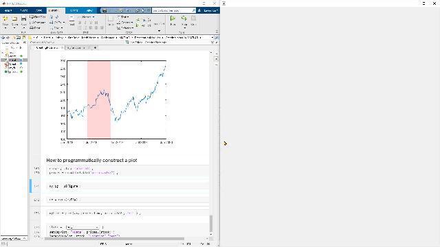
To access the first tile, I use this command next tile. I do the plot. I insert the title. Once that is done, I move on to the next plot. So on, until I come to the end of the plot. The next case, we're going to look at the plot where we can highlight a section of the plot based on certain criteria.
So we start by making our plot using this command. We use this function that we saw earlier, which is hold on. And we specify the criteria to stop, to highlight in our plot. So my criteria to highlight over here is based on date. So I could choose to update, let's say, put an area on top of the entire plot using this command called area. So I specified the x values to create and the y values to create a plot.
Now, I could also choose to change the transparency of this plot that I've imposed on it. So if I set that to 100%, you don't see what's going on behind this plot. On the other hand, if I bring it down to 0, you still see what is being plotted behind the area that I've plotted on top of it. So that brings us to the end of the advanced plots that we could do.
Now, is there a way to programmatically construct a plot? So we already saw some notions of programmatically constructing a plot when we updated the x tick label programmatically. So there are other properties that you could set programmatically. Let's explore them. So let's say over here, I'm creating a figure by using this command, ui figure. Let's put that onto the left hand side.
Now to add axes to this figure that I just created, I use this function axes, and I pass in the argument that I created earlier, my figure. And the output of that I store into axes. So here I've inserted axes on the figure. Now onto these axes, I'm plotting the prices of Apple. And I'm still holding a control of my plot over here, into this variable.
Let's just go ahead and explode this variable, my plot. You can see that there are some properties over here. To explore more properties, click on show all properties. Here, we can see that there's some property called x data, y data. So let's look at what is there inside. y data. So this is the price of Apple that has been plotted over here.
Now, in order to plot a different stock, we don't need to create this image again. All we have to do is change the data that's stored in y data. And that's exactly what we're going to do over here. So here I'm using a control where I have stored the names of stocks. By clicking on that, that gets stored into this variable called stock. And by using that value here, I can access the prices over here. And I set them into the y data.
So I set this value of y data by using this function called set. I specify the legend with a stock name as well. So here you can see my image, my plot got updated with the stock prices and the stock name. If I change that to Apple, let's say, I get this new plot. Say yes. So you can see the plot changes dynamically.
So that brings us to the end of the script that we were looking at. Before leaving, let's look at one of these links, which is the MATLAB plot gallery. It's a web page where you have a lot of different plots from MATLAB. You can work with all of these plots. You can explore different ways to work with your data graphically. So you have some standard plots. You have some customizing plots. And few advanced plots to work with. The code, along with the plot, is available at this web page. That's it, thank you.
Featured Product
MATLAB


Seleccione un país/idioma
Seleccione un país/idioma para obtener contenido traducido, si está disponible, y ver eventos y ofertas de productos y servicios locales. Según su ubicación geográfica, recomendamos que seleccione: United States.
También puede seleccionar uno de estos países/idiomas:
América
- América Latina (Español)
- Canada (English)
- United States (English)
Europa
- Belgium (English)
- Denmark (English)
- Deutschland (Deutsch)
- España (Español)
- Finland (English)
- France (Français)
- Ireland (English)
- Italia (Italiano)
- Luxembourg (English)
- Netherlands (English)
- Norway (English)
- Österreich (Deutsch)
- Portugal (English)
- Sweden (English)
- Switzerland
- United Kingdom (English)