Create Histograms Using MapReduce
This example shows how to visualize patterns in a large data set without having to load all of the observations into memory simultaneously. It demonstrates how to compute lower volume summaries of the data that are sufficient to generate a graphic.
Histograms are a common visualization technique that give an empirical estimate of the probability density function (pdf) of a variable. Histograms are well-suited to a big data environment, because they can reduce the size of raw input data to a vector of counts. Each count is the number of observations that falls within each of a set of contiguous, numeric intervals or bins.
The mapreduce function computes counts separately on multiple blocks of the data. Then mapreduce sums the counts from all blocks. The map function and reduce function are both extremely simple in this example. Nevertheless, you can build flexible visualizations with the summary information that they collect.
Prepare Data
Create a datastore using the airlinesmall.csv data set. This 12-megabyte data set contains 29 columns of flight information for several airline carriers, including arrival and departure times. In this example, select ArrDelay (flight arrival delay) as the variable of interest.
ds = tabularTextDatastore('airlinesmall.csv', 'TreatAsMissing', 'NA');
ds.SelectedVariableNames = 'ArrDelay';
The datastore treats 'NA' values as missing, and replaces the missing values with NaN values by default. Additionally, the SelectedVariableNames property allows you to work with only the selected variable of interest, which you can verify using preview.
preview(ds)
ans=8×1 table
    ArrDelay
    ________

        8
        8
       21
       13
        4
       59
        3
       11
Run MapReduce
The mapreduce function requires a map function and a reduce function as inputs. The mapper receives blocks of data and outputs intermediate results. The reducer reads the intermediate results and produces a final result.
In this example, the mapper collects the counts of flights with various amounts of arrival delay by accumulating the arrival delays into bins. The bins are defined by the fourth input argument to the map function, edges.
Display the map function file.
function visualizationMapper(data, ~, intermKVStore, edges)
  % Count how many flights have arrival delay in each interval specified by
  % the EDGES vector, and add these counts to INTERMKVSTORE.
  counts = histc(data.ArrDelay, edges);
  add(intermKVStore, 'Null', counts);
end
The bin size of the histogram is important. Bins that are too wide can obscure important details in the data set. Bins that are too narrow can lead to a noisy histogram. When working with very large data sets, it is best to avoid making multiple passes over the data to try out different bin widths. A simple way to avoid making multiple passes is to collect counts with bins that are narrow. Then, to get wider bins, you can aggregate adjacent bin counts without reprocessing the raw data. The flight arrival delays are reported in 1-minute increments, so define 1-minute bins from -60 minutes to 599 minutes.
edges = -60:599;
Create an anonymous function to configure the map function to use the bin edges. The anonymous function allows you to specialize the map function by specifying a particular value for its fourth input argument. Then, you can call the map function via the anonymous function, using only the three input arguments that the mapreduce function expects.
ourVisualizationMapper = ...
    @(data, info, intermKVstore) visualizationMapper(data, info, intermKVstore, edges);
Display the reduce function file. The reducer sums the counts stored by the mapper.
function visualizationReducer(~, intermValList, outKVStore)
  if hasnext(intermValList)
    outVal = getnext(intermValList);
  else
    outVal = [];
  end
  while hasnext(intermValList)
    outVal = outVal + getnext(intermValList);
  end
  add(outKVStore, 'Null', outVal);
end
Use mapreduce to apply the map and reduce functions to the datastore, ds.
result = mapreduce(ds, ourVisualizationMapper, @visualizationReducer);
********************************
*      MAPREDUCE PROGRESS      *
********************************
Map   0% Reduce   0%
Map  16% Reduce   0%
Map  32% Reduce   0%
Map  48% Reduce   0%
Map  65% Reduce   0%
Map  81% Reduce   0%
Map  97% Reduce   0%
Map 100% Reduce   0%
Map 100% Reduce 100%
mapreduce returns an output datastore, result, with files in the current folder.
Organize Results
Read the final bin count results from the output datastore.
r = readall(result);
counts = r.Value{1};
Visualize Results
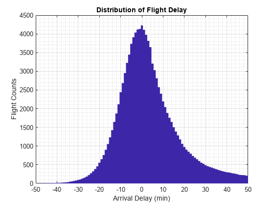
Plot the raw bin counts using the whole range of the data (apart from a few outliers excluded by the mapper).
bar(edges, counts, 'hist');
title('Distribution of Flight Delay')
xlabel('Arrival Delay (min)')
ylabel('Flight Counts')

The histogram has long tails. Look at a restricted bin range to better visualize the delay distribution of the majority of flights. Zooming in a bit reveals there is a reporting artifact; it is common to round delays to 5-minute increments.
xlim([-50,50]);
grid on
grid minor

Smooth the counts with a moving average filter to remove the 5-minute recording artifact.
smoothCounts = filter( (1/5)*ones(1,5), 1, counts);
figure
bar(edges, smoothCounts, 'hist')
xlim([-50,50]);
title('Distribution of Flight Delay')
xlabel('Arrival Delay (min)')
ylabel('Flight Counts')
grid on
grid minor
To give the graphic a better balance, do not display the top 1% of most-delayed flights. You can tailor the visualization in many ways without reprocessing the complete data set, assuming that you collected the appropriate information during the full pass through the data.
empiricalCDF = cumsum(counts);
empiricalCDF = empiricalCDF / empiricalCDF(end);
quartile99 = find(empiricalCDF>0.99, 1, 'first');
low99 = 1:quartile99;

figure
empiricalPDF = smoothCounts(low99) / sum(smoothCounts);
bar(edges(low99), empiricalPDF, 'hist');

xlim([-60,edges(quartile99)]);
ylim([0, max(empiricalPDF)*1.05]);
title('Distribution of Flight Delay')
xlabel('Arrival Delay (min)')
ylabel('Probability Density')

See Also
mapreduce | tabularTextDatastore