violinplot
Syntax
Description
Vector and Matrix Data
violinplot( creates a Violin Plot for each column of the
matrix ydata)ydata. If ydata is a vector, then
violinplot creates a single violin plot.
violinplot(
groups the data in xgroupdata,ydata)ydata according to the unique values in
xgroupdata and plots each group of data as a separate violin plot.
xgroupdata determines the position of each violin plot along the
x-axis.
violinplot(___,GroupByColor=
uses color to differentiate between violin plots. The function groups the data in
cgroupdata)ydata according to the unique value combinations in
xgroupdata (if specified) and cgroupdata, and
plots each group of data as a separate violin plot. The vector
cgroupdata then determines the color of each violin plot.
ydata must be a vector, and cgroupdata must
have the same length as ydata. Specify the color grouping data
name-value pair argument after any of the input argument combinations in the previous
syntaxes.
Table Data
violinplot(
creates a violin plot of the data in tbl,xvar,yvar)yvar grouped by the data in
xvar, where xvar and yvar
are variables from the table tbl. To plot one data set, specify one
variable for xvar and one variable for yvar. To plot
multiple data sets, specify multiple variables for xvar,
yvar, or both. If both arguments specify multiple variables, they
must specify the same number of variables.
Additional Options
violinplot(___,
specifies additional options using one or more name-value arguments. For example, you can
specify the orientation and which half of the violin to plot.Name=Value)
v = violinplot(___)ViolinPlot object or a vector of ViolinPlot objects.
Use v to set properties of the violin plots after creating them. For
a list of properties, see ViolinPlot Properties.
Examples
Create a single violin plot from a vector of patient ages. Use the violin plot to analyze the distribution of ages.
Load the patients data set. The Age vector contains the ages of 100 patients. Create a violin plot to visualize the distribution of ages.
load patients
violinplot(Age)
ylabel("Age (years)")

The outline of the violin plot is determined by the kernel density estimate (kde) for the probability density function. The kde is bell-shaped with a peak near 40 on the horizontal axis. The plot shows that the data in Age is approximately normally distributed and the median patient age is around 40.
Generate a matrix of normally distributed random numbers. Create a violin plot for the data in each column of the matrix.
ydata = randn(100,3);
violinplot(ydata)

The three violin plots have group labels 1, 2, and 3. The shapes of the violin plots are slightly different due to randomness in the data. However, each violin plot has the bell shape characteristic of a normal distribution.
Generate a vector of normally distributed random numbers and create a vector of grouping data.
ydata = randn(100,1);
xgroupdata = categorical(repelem(["group1";"group2";"group3"],[20,50,30]));
Create a set of violin plots for the data in ydata grouped by the unique values in xgroupdata. Each violin plot in the figure corresponds to a unique value in xgroupdata.
violinplot(xgroupdata,ydata)

Since R2025a
Load the tsunami data set into a table. Create violin plots for the Longitude and Latitude variables.
T = readtable('tsunamis.xlsx');
violinplot(T,["Longitude","Latitude"])
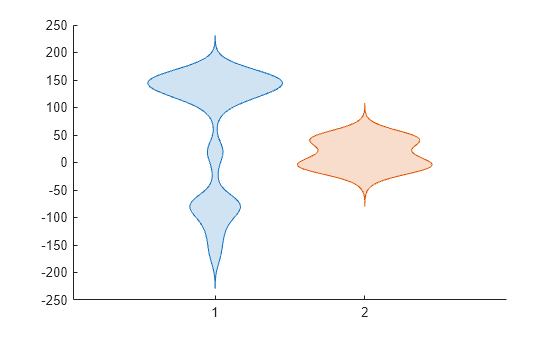
The two violin plots have group labels 1 and 2.
Generate two vectors of normally distributed data and three vectors of grouping data.
ydata1 = randn(100,1);
ydata2 = randn(100,1)+5;

xgroupdata1 = categorical(repelem(["group1";"group2"],[90,10]));
xgroupdata2 = categorical(repelem(["group1";"group2"],[10,90]));
xgroupdata3 = categorical(repelem(["group3";"group4"],[25,75]));
The variables ydata1 and ydata2 contain normally distributed data with means of 0 and 5, respectively. xgroupdata1 and xgroupdata2 contain different sequences of the same group labels. xgroupdata3 contains different group labels from those in xgroupdata1 and xgroupdata2.
Create a table from the sample data and grouping data.
tbl = table(xgroupdata1,xgroupdata2,xgroupdata3, ...
    ydata1,ydata2,VariableNames=["X1","X2","X3","Y1","Y2"]);
Create a set of overlaid violin plots using the data in ydata1 grouped by xgroupdata1 and xgroupdata2.
violinplot(tbl,["X1","X2"],"Y1")

The figure shows two sets of overlaid violin plots. The blue violin plots represent the data in ydata1 grouped by xgroupdata1, and the orange violin plots represent the same data grouped by xgroupdata2. The overlaid plots show that the different groupings do not significantly change the median values for each group. However, the different groupings have a visible effect on the shape of the violin plots corresponding to each group. This result suggests that the distribution of the data in each group is affected by how the data is grouped.
Create another set of violin plots using the data in ydata1 grouped by xgroupdata1 and the data in ydata2 grouped by xgroupdata3.
violinplot(tbl,["X1","X3"],["Y1","Y2"])
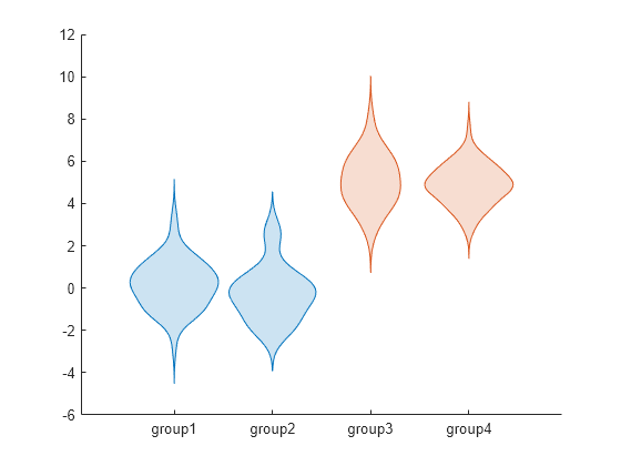
The blue plots corresponding to groups 1 and 2 represent the data in ydata1, and the orange plots corresponding to groups 3 and 4 represent the data in ydata2. The plots show that the median values for the data in groups 3 and 4 are larger than those for groups 1 and 2.
Generate a vector of normally distributed random numbers. Create two vectors for positional and color grouping data.
ydata = randn(100,1);

xgroupdata = categorical(repelem(["group1";"group2";"group3"],[20;50;30]));
cgroupdata = categorical(repelem(["a";"b";"a";"b";"c";"d";"e"],[10;10;25;25;10;10;10]));
The variable ydata contains normally distributed data with a mean of 0. xgroupdata contains labels for three different groups. The labels in cgroupdata split the first two groups in xgroupdata into the same two colors, and the third group in xgroupdata into three different colors.
Plot the data in ydata using xgroupdata as the positional grouping data and cgroupdata as the color grouping data.
violinplot(xgroupdata,ydata,GroupByColor=cgroupdata)
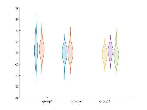
The figure shows a set of violin plots for each of the three group labels in xgroupdata. The sets for groups 1 and 2 each contain an orange and a blue violin plot. The set of violin plots for group 3 contains a yellow, a purple, and a green violin plot.
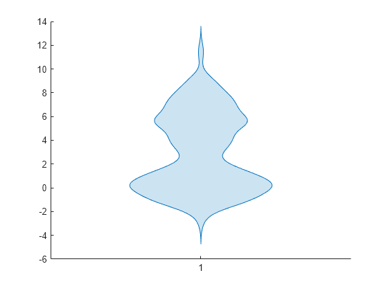
Generate a vector of random numbers. Estimate the pdf for the data by calculating its kernel density estimate (kde).
ydata = [randn(100,1); 6+2*randn(100,1)];
[f,xf] = kde(ydata,Bandwidth=0.6);
f contains values for the kde, and xf contains the corresponding evaluation points.
Create a violin plot using f as the density values and xf as the evaluation points. The shape of the violin plot shows that the data has a bimodal nature.
violinplot(EvaluationPoints=xf,DensityValues=f)
Create two vectors of randomly generated data. Create two vectors of positional grouping data.
ydata1 = randn(100,1);
ydata2 = [randn(25,1)+2;randn(75,1)+5];

xgroupdata1 = repelem([1;2],[50;50]);
xgroupdata2 = repelem([1;2],[25;75]);;
The variables ydata1 and ydata2 contain the randomly generated data. xgroupdata1 and xgroupdata2 contain different sequences of the same two group labels.
Compare the data in ydata1 grouped by the labels in xgroupdata1 with the data in ydata2 grouped by the labels in xgroupdata2. For each group, create a horizontal violin plot with the data in ydata1 represented in the top half and the data in ydata2 represented in the bottom half.
violinplot(xgroupdata1,ydata1,Orientation="horizontal",DensityDirection="positive")
hold on
violinplot(xgroupdata2,ydata2,Orientation="horizontal",DensityDirection="negative")
legend("ydata1","ydata2")
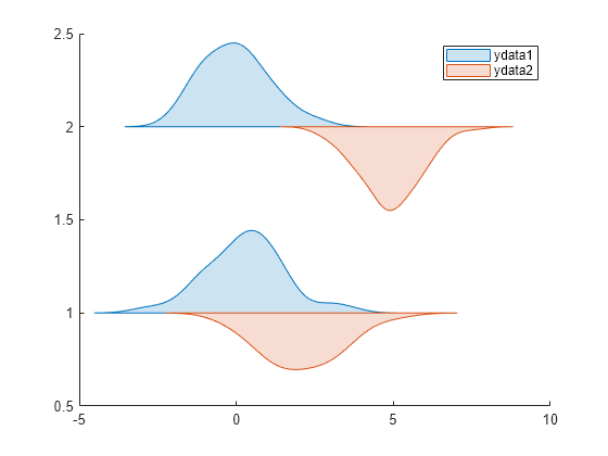
The violin plots show that, for each group, the data for ydata1 and ydata2 is approximately normally distributed and the data for ydata1 has a smaller mean than the data for ydata2. Moreover, the data for ydata2 has a larger mean in group 2 than it does in group 1.
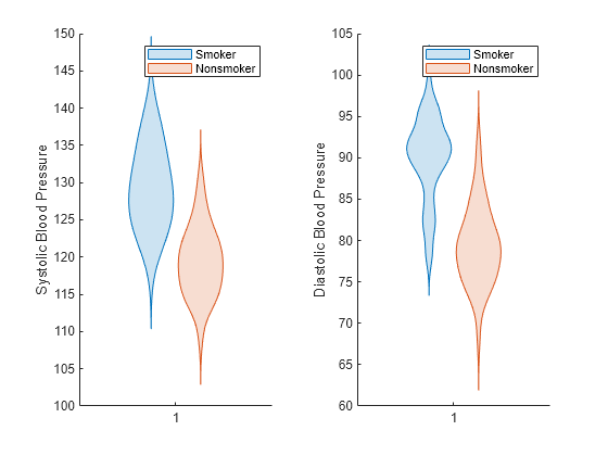
Create violin plots from patient data to compare the blood pressure of smokers and nonsmokers. The plots show that smokers have higher systolic and diastolic blood pressure than nonsmokers.
Load the patients data set. Convert Smoker to a categorical variable with the descriptive category names Smoker and Nonsmoker rather than 1 and 0.
load patients
Smoker = categorical(Smoker,logical([1 0]),["Smoker","Nonsmoker"]);
Create a 1-by-2 tiled chart layout using the tiledlayout function. Create the first set of axes ax1 by calling the nexttile function. In the first set of axes, display two violin plots representing the systolic blood pressure values, one for smokers and the other for nonsmokers. Create the second set of axes ax2 within the tiled chart layout by calling the nexttile function. In the second set of axes, do the same for diastolic blood pressure.
tiledlayout(1,2)

% Left axes
ax1 = nexttile;
violinplot(ax1,Systolic,GroupByColor=Smoker)
ylabel(ax1,'Systolic Blood Pressure')
legend("Smoker","Nonsmoker")

% Right axes
ax2 = nexttile;
violinplot(ax2,Diastolic,GroupByColor=Smoker)
ylabel(ax2,"Diastolic Blood Pressure")
legend("Smoker","Nonsmoker")
Load the patients data set, and convert the Smoker variable to categorical.
load patients
Smoker = categorical(Smoker,logical([1 0]),["Smoker","Nonsmoker"]);
The variables Diastolic and Smoker contain data for patient diastolic blood pressure and smoker status.
Create a set of violin plots for the data in Diastolic grouped by Smoker.
v = violinplot(Diastolic,GroupByColor=Smoker)
v =
  1×2 ViolinPlot array:

    ViolinPlot    ViolinPlot
v is an array containing two ViolinPlot objects. You can modify the violin plots by specifying the properties of the ViolinPlot objects in v. For more information, see ViolinPlot Properties.
Update the colors of the violin plots so that the plot for smokers is pink and the plot for nonsmokers is green.
v(1).FaceColor = [1 0 1]; % Pink
v(2).FaceColor = [0 1 0]; % Green
legend("Smoker","Nonsmoker")

Input Arguments
Sample data, specified as a numeric vector or matrix.
If
ydatais a matrix, thenviolinplotcreates a violin plot for each column ofydata.If
ydatais a vector and you do not specifyxgroupdataorcgroupdata, thenviolinplotcreates a single violin plot.If
ydatais a vector and you specifyxgroupdataorcgroupdata, thenviolinplotcreates a violin plot for each unique value combination inxgroupdataandcgroupdata.
Data Types: single | double
Positional grouping data, specified as a numeric or categorical vector, or a numeric or categorical matrix.
If ydata is a vector of length n, then
xgroupdata must be a vector of length n or a
matrix with n rows.
If ydata is a matrix, then xgroupdata must
be a matrix of the same size or a vector of length equal to the number of rows or
columns in ydata.
violinplot groups the data in ydata
according to the unique value combinations in xgroupdata and
cgroupdata, and creates a violin plot for each group. By default,
violinplot vertically orients the violin plots and displays the
xgroupdata values along the x-axis. You can
change the violin plot orientation by using the Orientation
property.
Data Types: single | double | categorical
Color grouping data, specified as a numeric vector, categorical vector, logical
vector, string array, character vector, or cell array of character vectors.
cgroupdata must have the same length as the vector
ydata; you cannot specify cgroupdata when
ydata or xgroupdata is a matrix.
violinplot groups the data in ydata
according to the unique value combinations in xgroupdata and
cgroupdata. The function creates a violin plot for each group of
data and assigns the same color to groups with the same cgroupdata
value.
Data Types: single | double | categorical | logical | string | char | cell
Source table containing the data to plot, specified as a table or timetable.
Table variables containing the positional grouping data, specified as one or more table variable indices. The table variables you specify must contain numeric, categorical, datetime, or duration values.
Specifying Table Indices
Use any of the following indexing schemes to specify the intended variable or variables.
| Indexing Scheme | Examples |
|---|---|
Variable names:
|
|
Variable indices:
|
|
Variable type:
|
|
Plotting Your Data
To plot one set of violin plots, specify one variable for xvar
and one variable for yvar. For example, create a table with one
categorical grouping variable and two variables containing normally distributed random
values. Plot the data in Y1 grouped by the data in
X.
X = categorical(repelem(["a1";"b1"],50));
Y1 = randn(100,1);
Y2 = 5*randn(100,1)+10;
tbl = table(X,Y1,Y2);

violinplot(tbl,"X","Y1")
To plot multiple data sets together, specify multiple variables for
xvar, yvar, or both. If you specify multiple
variables for both arguments, the number of variables for each argument must be the
same.
For example, create a set of violin plots from the data in Y1
using X as the grouping variable, and a set using
Y2 as the
data.
violinplot(tbl,"X",["Y1","Y2"])
You can also use different indexing schemes for xvar and
yvar. For example, specify xvar as a variable
name and yvar as an index
number.
violinplot(tbl,"X",3)Table variables containing the sample data, specified as one or more table variable indices. The table variables you specify must contain numeric, categorical, datetime, or duration values.
Specifying Table Indices
Use any of the following indexing schemes to specify the intended variable or variables.
| Indexing Scheme | Examples |
|---|---|
Variable names:
|
|
Variable indices:
|
|
Variable type:
|
|
Plotting Your Data
To plot one set of violin plots, specify one variable for xvar
and one variable for yvar. For example, create a table with two
categorical grouping variables and one variable containing normally distributed random
values. Plot the data in Y grouped by the data in
X1.
X1 = categorical(repelem(["a1";"b1"],50));
X2 = categorical(repelem(["a2";"b2";"c2"],[33,33,34]));
Y = randn(100,1);
tbl = table(X1,X2,Y);

violinplot(tbl,"X1","Y")
To plot multiple data sets together, specify multiple variables for
xvar, yvar, or both. If you specify multiple
variables for both arguments, the number of variables for each argument must be the
same.
For example, create a set of violin plots from the data in Y
using X1 as the grouping variable, and a set using
X2 as the grouping
variable.
violinplot(tbl,["X1","X2"],"Y")
You can also use different indexing schemes for xvar and
yvar. For example, specify xvar as a variable
name and yvar as an index
number.
violinplot(tbl,"X1",3)Evaluation points for the probability density function (pdf), specified as one of these values:
numeric vector — Create a single violin plot using the evaluation points in
evalPtsand the pdf values indensVals.numeric matrix — Create multiple violin plots. Each violin plot represents the evaluation points in a column of
evalPtsand the pdf values in the corresponding column ofdensVals.
If you specify evalPts, you must also specify
densVals, and they must be the same size.
Data Types: single | double
Values for the pdf, specified as one of these values:
numeric vector — Create a single violin plot using the evaluation points in
evalPtsand the pdf values indensVals.numeric matrix — Create multiple violin plots. Each violin plot represents the evaluation points in a column of
evalPtsand the pdf values in the corresponding column ofdensVals.
If you specify densVals, you must also specify
evalPts, and they must be the same size.
Data Types: single | double
Target axes, specified as an Axes object. If you do not specify the
axes, then violinplot uses the current axes
(gca).
Name-Value Arguments
Specify optional pairs of arguments as
Name1=Value1,...,NameN=ValueN, where Name is
the argument name and Value is the corresponding value.
Name-value arguments must appear after other arguments, but the order of the
pairs does not matter.
Example: violinplot(ydata,Orientation="horizontal",DensityDirection="negative")
uses the data in ydata to plot the bottom half of a horizontal violin
plot.
Note
The ViolinPlot properties listed here are only a subset. For a
complete list, see ViolinPlot Properties.
Maximum violin plot width, specified as a positive scalar.
DensityWidth has the same units as the positional grouping data
specified by xgroupdata or xvar.
Example: DensityWidth=0.5
Data Types: single | double
Plot a full or half violin, specified as one of the values in this table.
| Value | Description |
|---|---|
"both" | Plot both halves of the violin. |
"positive" | Plot the positive half of the violin, which depends on the
|
"negative" | Plot the negative half of the violin, which depends on the
|
Example: DensityDirection="negative"
Data Types: string | char
Method for normalizing the violin plots, specified as one of the values in this table.
| Value | Description |
|---|---|
"area" | The violin plots have equal areas. |
"width" | The violin plots have widths equal to
DensityWidth. |
"count" | The violin plots have widths proportional to the number of data points in each group. |
Example: DensityScale="count"
Data Types: string | char
Orientation of the violin plots, specified as "vertical" or
"horizontal". By default, the violin plots are vertically
oriented so that the violin plots align with the y-axis.
Regardless of the orientation, violinplot stores the sample data
in the YData property of the ViolinPlot
object.
Example: Orientation="horizontal"
Data Types: string | char
Since R2025a
Color group layout, specified as "grouped" or
"overlaid". By default, the violin plots in each color grouping are
plotted next to each other.
If you specify ColorGroupLayout="overlaid":
The violin plots in each color grouping are plotted on top of each other.
The function ignores the value of
ColorGroupWidth.You can adjust the space between each overlaid color grouping by specifying
DensityWidth.
Data Types: string | char
Output Arguments
Violin plots, returned as a ViolinPlot object or a vector of
ViolinPlot objects.
If you specify
ydataas a matrix,violinplotreturns one object per column.If you specify
tbl,violinplotreturns one object per index inxvaroryvar, whichever has the most elements.If you specify
cgroupdata,violinplotreturns one object per group.
Use v to set properties of the violin plots after
creating them. For a list of properties, see ViolinPlot Properties.
More About
A violin plot provides a visual representation of the empirical distribution for a data sample. The shape of a violin plot is determined by the kernel density estimate (kde) for the probability density function (pdf) reflected about the vertical axis.
Version History
Introduced in R2024bYou can create violin plots from table and timetable data without specifying grouping
variables. Use the new syntax violinplot(tbl,yvar) to create violin plots
from the yvar variables in table tbl.
If you specify vector input data, you can specify the positional grouping data as a
matrix. For example, in the syntax violinplot(xgroupdata,ydata), if
ydata is a vector of length n, then you can
specify xgroupdata as a matrix with n rows.
You can customize the width and layout of color groups using these name-value arguments:
ColorGroupWidth— Adjust the space between each violin plot color grouping.ColorGroupLayout— Specify whether to group or overlay the violin plots in each color grouping.DensityWidth— Adjust the space between each overlaid color grouping.
MATLAB Command
You clicked a link that corresponds to this MATLAB command:
Run the command by entering it in the MATLAB Command Window. Web browsers do not support MATLAB commands.
Seleccione un país/idioma
Seleccione un país/idioma para obtener contenido traducido, si está disponible, y ver eventos y ofertas de productos y servicios locales. Según su ubicación geográfica, recomendamos que seleccione: .
También puede seleccionar uno de estos países/idiomas:
Cómo obtener el mejor rendimiento
Seleccione China (en idioma chino o inglés) para obtener el mejor rendimiento. Los sitios web de otros países no están optimizados para ser accedidos desde su ubicación geográfica.
América
- América Latina (Español)
- Canada (English)
- United States (English)
Europa
- Belgium (English)
- Denmark (English)
- Deutschland (Deutsch)
- España (Español)
- Finland (English)
- France (Français)
- Ireland (English)
- Italia (Italiano)
- Luxembourg (English)
- Netherlands (English)
- Norway (English)
- Österreich (Deutsch)
- Portugal (English)
- Sweden (English)
- Switzerland
- United Kingdom (English)