Plot a Circle Using the XY Graph Block
This example shows how to plot data using the XY Graph block. The XY Graph block is an alternative configuration of the Record block that plots two input signals on an XY plot. The XY plot used by the Record block is also available in the Simulation Data Inspector. The XY Graph block has all the capabilities of the Record block, including the ability to log data to the workspace and a file.
The model computes and data to plot a circle using a third variable, . Using a polar coordinate system, you can express the equation for a circle of radius centered on the origin as:
Converting the equation to use Cartesian coordinates results in these equations for the and data:
The model computes the and data using Trigonometric Function blocks. The Ramp block provides the input and the Constant block sets the radius of the circle. Open and simulate the model.
mdl = "XYGraphCircle";
open_system(mdl);
sim(mdl);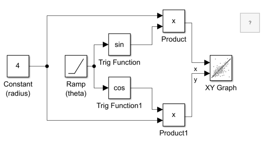
To view the plotted results, double-click the XY Graph block.

You can add subplots to the layout in the XY Graph block to view the and data variations against time. For example, select Layouts. Then, under Overlays, select Bottom. To view the signals, click Show Signals. To plot the x signal, select the left overlay, then select the check box next to the x signal. To plot the y signal, select the right overlay, then select the y signal.
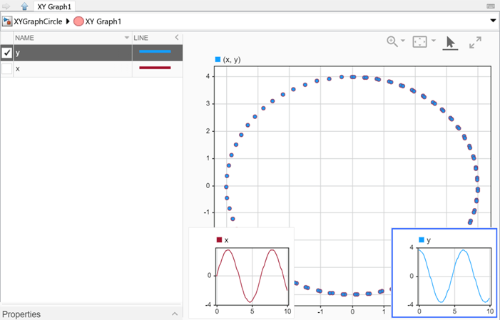
You can also update the styling of the data plotted on the XY plot. For example, add a connecting line and remove the data markers. Select the XY subplot. To add a connecting line to the plot, on the Format tab, under Line, click Line. To remove the markers from the plot, on the Format tab, under Markers, click Markers.

The XY plot supports other analysis and visualization features, including trend lines and the ability to plot more than one series. For more information, see Visualize Simulation Data on XY Plot and Analyze Data Using XY Plot.